


I taught myself how to design websites at age 11. I was a pretty nerdy kid, but it paid off in college when I got a job designing websites for the Division of Student Life at the University of Iowa, including student organizations, bookstore pages, and event websites.
One of the greatest lessons my boss at the time shared with me was to always be thinking of how the user will interact with your website. You may think that your design is perfect and flawless, but upon further inspection, realize that certain things just don’t make sense to someone that isn’t you.
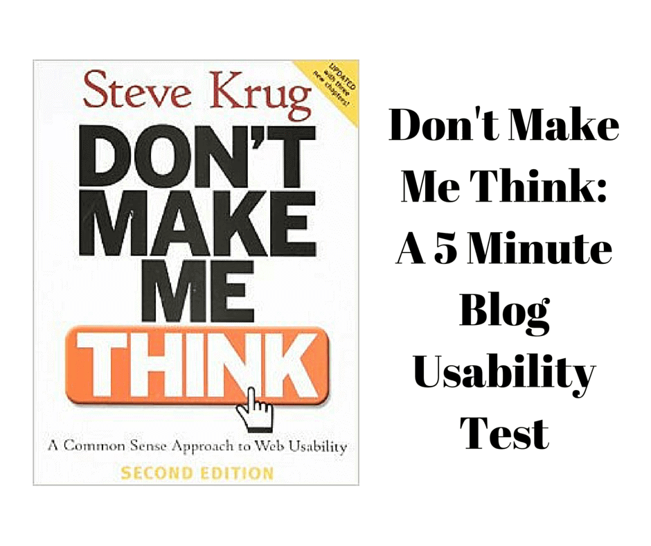
As such, I’ve always approached website projects with a critical eye. One book that’s been on my to-read list for a long time is, “Don’t Make Me Think” by Steve Krug. This book takes the lessons my old boss taught me to the next level, as a more formulaic approach to user experience.
Most bloggers have a rudimentary understanding of coding and backend processes on their blog – and that’s ok. Usability is more about the flow and state of mind of someone going through your website, plus how they interact with it.
Take a critical look at your blog and follow along with my 5 minute blog usability test, inspired by the teachings in “Don’t Make Me Think.”
Jump Ahead to a Specific Section:
Blog Usability Test
Are the most important parts of your blog above the fold?
If you haven’t heard the term, “above the fold” refers to the part of the website a person can see before scrolling on a desktop/laptop computer. In terms of a blog website, the most important things to display above the fold include:
- Email signup form
- Basic Navigation
- Title and first paragraph (at least) of your post
The simple fact of the matter is that some people won’t go below the fold, so you need to position elements that are the most important/could convince someone to keep exploring your blog.
Does your navigation make sense?
For example, if you have a regular website with a blog extension, does the link say “Blog” or something else, like “News”? Don’t make people think more than they have to. They’re expecting you to call it what it is, and what they’re used to… a blog.
If your navigation is by category, try to be succinct but descriptive in your titles so people get what they expect. There should never be a case where they follow a link and are completely confused by what they find there.
Furthermore, if you expect someone to click something, make sure it looks clickable. Add button styling or at the very least, change the color of the text or add an underline on hover. These are pretty simple CSS commands, but if that’s not something you understand, a web developer could make these changes for you very easily.
Are your blog posts scannable?
“Don’t Make Me Think” preaches Fact of Life #1 being, “We don’t read pages. We scan them.” Nothing could be more true of blogs. Make sure to separate posts into paragraphs no more than 2-3 lines when possible, add bullet points, and use underline, bold or italics for emphasis on important points.
If people see a block of text with no whitespace, they may give up before giving your blog the chance it deserves.
Does your blog have a good visual hierarchy in navigation?
It should be obvious to your reader by font size and decoration what the difference is between the title, heading, and page content. Does your blog make it easy to determine these differences?
Also – breadcrumbs are very useful for helping people keep stock of where they’re at on your blog. They come standard on many WordPress themes, but basically show the path a person took to get to the page they’re currently on. For example, the breadcrumb for this blog post would look like:
Home > Blog > How-To (category) > Don’t Make Me Think: A 5 Minute Blog Usability Test (individual post)
Furthermore, don’t make people think harder by changing navigation on them from page to page. Keep the style and format consistent across your blog, unless you have a landing page that is intended to look completely different, or the home page.
Are you using your home page effectively?
In “Don’t Make Me Think,” Steve Krug has a lot of great suggestions for a homepage. He states that it contains the most valuable real estate on your website, so you should take care with what you put on it.
One thing that’s especially important for bloggers to display on a homepage is a tagline. If someone’s never been to your site before, they may be confused by looking at your content without a context. Make it easy for them to understand with a one-liner that describes what the blog is all about.
Other features to try and fit on the front page (as long as it doesn’t distract):
- Content teases (like an especially great post or contest)
- Timely content
- Deals (or perhaps ads in a bloggers case)
- Shortcuts to popular pages/articles
- Ideas for where to start
- Establish credibility (large comment counts, brands you’ve worked with, or feature something someone said about your blog in a quote)
Don’t just guess… test.
One final tip – Steve Krug says you should never make assumptions about how your choices have actually affected usability. There are two great tools you can use to judge the results of your actions:
- Google Analytics: If you don’t have this installed, you’re missing out on valuable opportunities for introspection and blog growth. Install it NOW.
- Inspectlet: There are free and paid versions of this tool. The free version allows for up to 100 unique sessions per month, where they’ll actually record how someone uses your blog. You can play it back and see what’s working and what isn’t.

Final Thoughts: Don’t Make Me Think — A 5 Minute Blog Usability Test
Whenever you build a new kind of page, you should always consider if it’s sensible or can present problems. These tests are the basic principles to get used to it.
What has helped you most from this 5 minute blog usability test?
Is there anything particular you’ll be working on in the next month or two? Or something else I missed that’s worth sharing? Let me know in the comments!

I like what you’re doing so far! A lot more organized/usable than most blog home pages 🙂 Best of luck with your blog resolutions in the new year!
Hi Maddy,
The most difficult part of creating my blog was determining how to use my homepage effectively. I’m still struggling with getting it juuuuust right, but I’m much happier with it now than I was when I first started. As I grow my blog this next year and add things like infoproducts to my lineup of offerings, I’m expecting to be able to fill my homepage a bit more (and use it more effectively).